Histograms: Understanding the Distribution of Data
Histograms are a powerful tool in statistics that allow us to visualize the distribution of a set of data. They are particularly useful for understanding the distribution of continuous variables, such as weight, height, or time. In this article, we will discuss the definition, construction, and interpretation of histograms.
What is a Histogram?
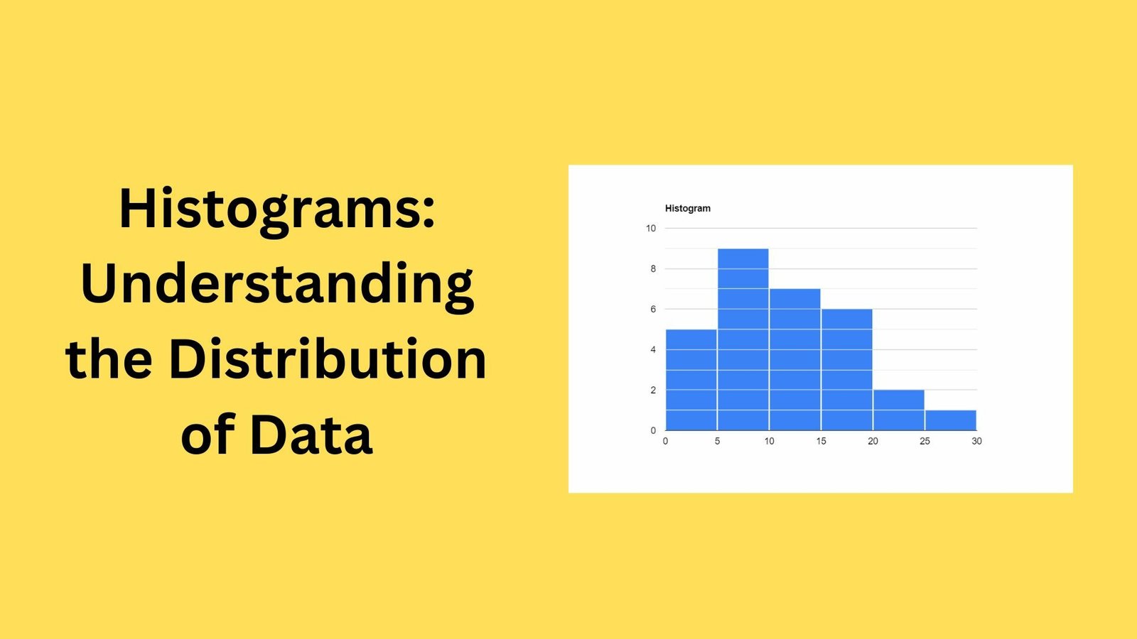
A histogram is a graphical representation of a distribution of data. It is a way to show the frequency of different values in a dataset. The x-axis represents the values of the data, while the y-axis represents the frequency of those values. Histograms are typically constructed using rectangular bars, with the height of each bar representing the frequency of the values in that range.
Construction of Histograms
To construct a histogram, the first step is to divide the range of values into intervals, also known as bins. The number of bins and the size of the intervals will depend on the specific dataset and the goals of the analysis. The next step is to count the number of observations that fall into each interval. This count is then represented by the height of the rectangular bar for that interval.
Interpreting Histograms
Histograms provide a visual representation of the distribution of a dataset. They can be used to identify patterns, outliers, and skewness in the data. For example, a symmetric distribution will have a bell-shaped histogram, while a skewed distribution will have a histogram with a longer tail on one side. Additionally, histograms can be used to identify outliers, which are values that fall outside the typical range of the data.
Key Takeaways
- Histograms are a powerful tool for visualizing the distribution of data.
- They are particularly useful for understanding the distribution of continuous variables.
- Histograms are constructed by dividing the range of values into intervals and counting the number of observations that fall into each interval.
- Histograms can be used to identify patterns, outliers, and skewness in the data.
In conclusion, histograms are a valuable tool for understanding the distribution of data. By constructing and interpreting histograms, we can gain insights into the patterns, outliers, and skewness in our data. By applying this knowledge, we can make more informed decisions and better understand our data.