Which data would be suitable for a Histogram?
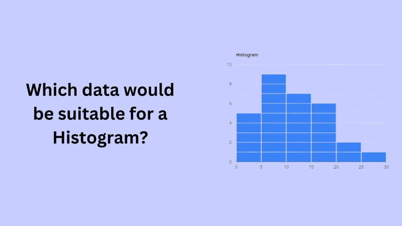
A histogram is a graphical representation of the distribution of numerical data. It is a type of bar chart that shows the frequency or number of observations within different numerical ranges, called bins. The bins are usually specified as consecutive, non-overlapping intervals of a variable. The histogram provides a visual representation of the distribution of the data, showing the number of observations that fall within each bin. This can be useful for identifying patterns and trends in the data, and for making comparisons between different datasets.
Histograms are best suited for representing continuous numerical data. This type of data is often found in scientific and engineering applications, where measurements are taken and recorded over time. Examples of continuous numerical data include temperature readings, pressure readings, or weight measurements.
One type of data that is well-suited for a histogram is data that follows a normal or Gaussian distribution. A normal distribution is a common type of distribution that is symmetrical and bell-shaped. Many natural phenomena, such as height, weight, and intelligence, follow a normal distribution. A histogram is a useful tool for visualizing a normal distribution, as it shows the frequency of observations within different bins, allowing you to see the shape of the distribution.
Another type of data that is well-suited for a histogram is data that is skewed, or has a long tail on one side. A skewed distribution is one that is not symmetrical, and has a longer tail on one side than the other. A histogram is a useful tool for visualizing a skewed distribution, as it shows the frequency of observations within different bins, allowing you to see the shape of the distribution and the presence of any outliers.
In addition to normal and skewed distributions, histograms can also be used to represent data that is grouped into distinct clusters. For example, a histogram could be used to show the distribution of test scores for a group of students, with the different bins representing the different score ranges. In this case, the histogram would show the number of students who scored within each range, allowing you to see the distribution of scores and the presence of any clusters or gaps in the data.
In conclusion, histograms are well-suited for representing continuous numerical data. This type of data is often found in scientific and engineering applications, and can include normal and skewed distributions, as well as data that is grouped into distinct clusters. Histograms are a useful tool for visualizing this type of data and for identifying patterns and trends.