When to use a Histogram?
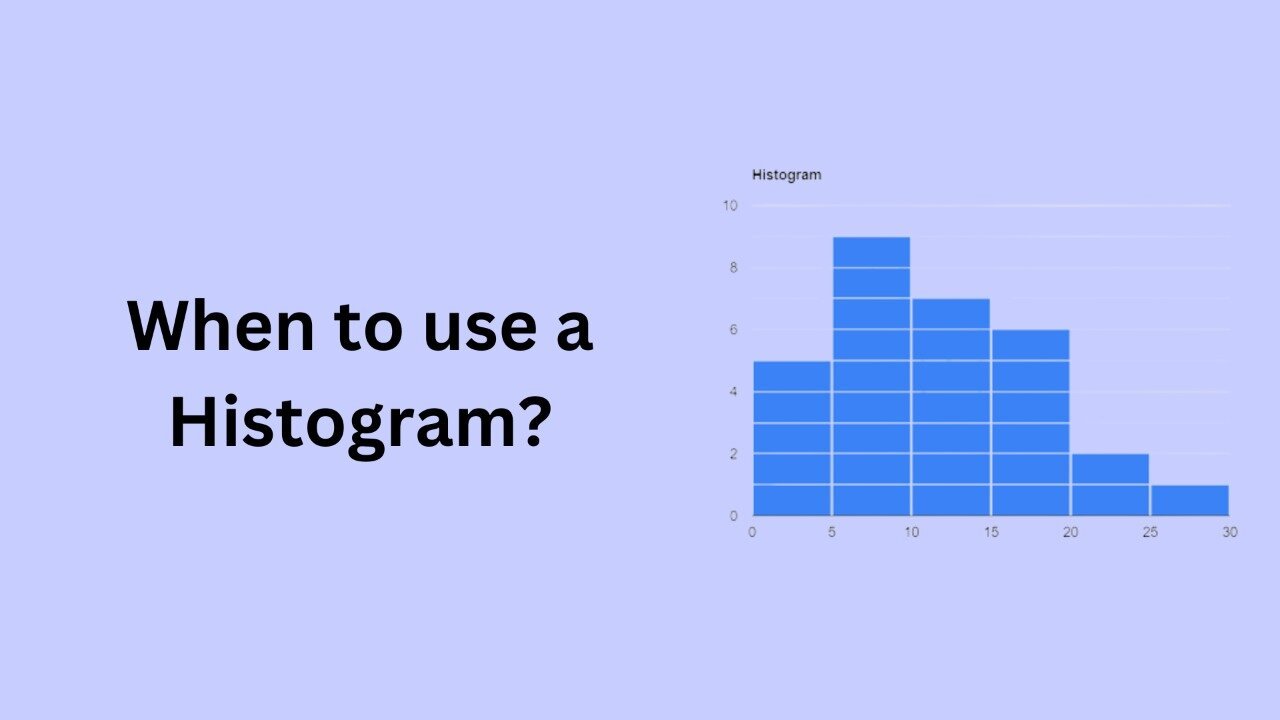
A histogram is a graphical representation of the distribution of numerical data. It is a type of bar chart that shows the frequency or number of observations within different numerical ranges, called bins. The histogram provides a visual representation of the distribution of the data, showing the number of observations that fall within each bin. This can be useful for identifying patterns and trends in the data, and for making comparisons between different datasets.
There are several situations in which a histogram may be the appropriate choice for visualizing data. Here are some examples of when to use a histogram:
- When you want to visualize the distribution of a single numerical variable. A histogram is a good choice for visualizing the distribution of a single numerical variable, as it shows the frequency of observations within different bins, allowing you to see the shape of the distribution. This can be useful for identifying patterns and trends in the data, and for making comparisons between different datasets.
- When you want to compare the distribution of multiple numerical variables. A histogram can also be used to compare the distribution of multiple numerical variables. For example, you could create separate histograms for each variable, and then use the same bin sizes and ranges for each histogram. This allows you to easily compare the distributions of the different variables, and to identify any similarities or differences between them.
- When you want to identify outliers in the data. A histogram can be useful for identifying outliers in the data, as it shows the frequency of observations within different bins. Outliers are observations that are significantly different from the majority of the data, and they can be identified by looking for observations that fall outside the normal range of the data.
- When you want to identify clusters or gaps in the data. A histogram can also be useful for identifying clusters or gaps in the data, as it shows the frequency of observations within different bins. Clusters are groups of observations that are close together, while gaps are areas where there are few or no observations. Identifying these patterns can be useful for understanding the data and for making decisions.
In conclusion, histograms are a useful tool for visualizing the distribution of numerical data. They are best suited for representing continuous data, and they are useful for identifying patterns and trends, comparing multiple variables, identifying outliers, and identifying clusters and gaps in the data. When used appropriately, histograms can provide valuable insights into your data.